YULIA BRODSKAYA
I have looked at Yulia work for task one, but for task 2 i wanted to get a broader idea of different techniques i could use for creating the poster, using the same ideas of paper enigeering i could make some interesting designs, Yulia work really stands out with her clean lines and use of colour , her work is so perfect it is almost hard to believe she has just manpilated paper to create these forms.
ROB RYAN
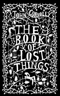
I have also looked at Rob Ryans work , but looking over them again is definitely worth it !, his work is incredible and the use of strong contrast and the control over the cut out lines makes me wonder if my hands could be this steady, the different technique in just these two typos gives me inspiration for my poster type, i want to look at creating strong line and shadow to bring out the contrast and although i might not be able to create such intricate lines i can practice.
JELENCE HARRISON
This is a new artist i found, similar to Robs work i was just really blown away by the use of the delicate frame and images in this work, the display of the equipment and the waste really shows of the skills and makes this pristine, clean work really look hand made , the use of the different fonts and sizes makes the whole piece flow through. i really like how the use of the type and image work together to create this piece.


No comments:
Post a Comment