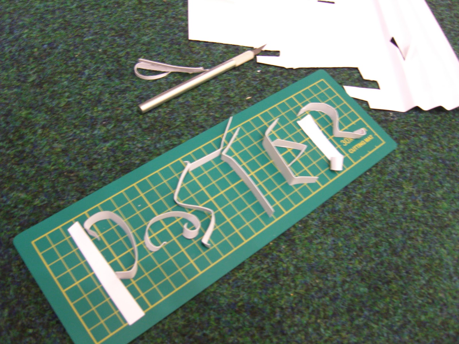
I was really inspriated after looking at all the paper typography artisits and i got out my paper and gave a good go at it, i found bending and folding small paper really hard and actually getting the message across clear was really hard.


I think this bold cut out in the card works better for me, the prestiner line and clean cut edges is a tall over for my shakey hands, but other then that this typo is bold clear and stands out really well.


Folding the paper and trying to create a type into the fold proved very difficult however the effect of this was worth it, although ive giving a small example the effect the folded lines have on the font it reallly interesting.


No comments:
Post a Comment