Monday 14 March 2011

Final poster design

 
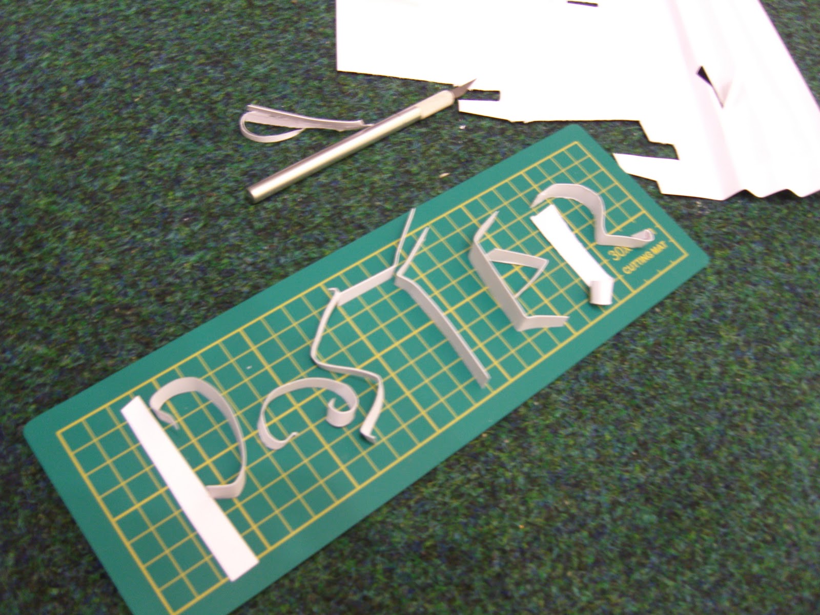
These are photographs of my task 2 poster, this poster is a development of my task 1 project to make a sculpture , i took the idea of the water lily flowers and to fit into this theme i thought creating water, using manipulated paper, by doing this i have managed to create the effect of waves, and what i found really interesting was that on the paper the folds created an area in which was really prominent and than the other side hidden from the camera, i thought the perfect way to tie in all the elements would be to put the text into the paper , using the techniques i looked at and have developed i cut out the text and using the studio i create shadows to really make this stand out .I was extremely happy with the final outcome and i think the elements work really well together and really show how i have developed my task 1 idea .

Task 1 developed for task 2

I wanted to look at puting a background in behind the flowers, to really bring it all together and make the flowers stand out, these paper folds create a similar effect as a wave and i have developed they paper to see if twisting and Turing the paper would  create a stronger visual link to the water which will work against the flowers.


I thought by twisting the paper it would create more of a wave shape but infact it takes away from the strong lines of the folds.
 
Another idea i looked at to develop the poster was to add butterfllies , as against the water and flowers it would have a strong nature theme , after experimenting in both colour and size i found that the butterflies where hard to hang and photograph and would distract from the main ideas.

my attempts at making typography

I was really inspriated after looking at all the paper typography artisits and i got out my paper and gave a good go at it, i found bending and folding small paper really hard and actually getting the message across clear was really hard.

 
I think this bold cut out in the card works better for me, the prestiner line and clean cut edges is a tall over for my shakey hands, but other then that this typo is bold clear and stands out really well.
 
Folding the paper and trying to create a type into the fold proved very difficult however the effect of this was worth it, although ive giving a small example the effect the folded lines have on the font it reallly interesting.

Typography ideas

YULIA BRODSKAYA

I have looked at Yulia work for task one, but for task 2 i wanted to get a broader idea of different techniques i could use for creating the poster, using the same ideas of paper enigeering i could make some interesting designs, Yulia work really stands out with her clean lines and use of colour , her work is so perfect it is almost hard to believe she has just manpilated paper to create these forms.

ROB RYAN

I have also looked at Rob Ryans work , but looking over them again is definitely  worth it !, his work is incredible and the use of strong contrast and the control over the cut out lines makes me wonder if my hands could be this steady, the different technique in just these two typos gives me inspiration for my poster type, i want to look at creating strong line and shadow to bring out the contrast and although i might not be able to create such intricate lines i can practice.  

JELENCE HARRISON

This is a new artist i found, similar to Robs work i was just really blown away by the use of the delicate frame and images in this work, the display of the equipment and the waste really shows of the skills and makes this pristine, clean work really look hand made , the use of the different fonts and sizes makes the whole piece flow through. i really like how the use of the type and image work together to create this piece.


Task 2 Brief

http://www.gfsmith.com/

I wanted to know more about the company i was creationg this poster on , i found this website and had a look throught the paper they do and how long they have been round there is lots of differnt samples of there paper in different qualitys and colours.

task 1 final piece

 
I have choosen this as my final scultture design after taking photographs of different layouts of the paper i decided that this is my favourite, i choose this becasue its a set of big four and small four and they all fit together nicely.

changing the sizes

 
I have looked at two different sizes for my flowers, initalaly i had the small flowers which was 13.5cm by 7.5cm and i though to make the flowers bolder and stand out more i doubled the size to 27cm by 15cm , and the two together work really well and completment really well.

Primary resources ( cactus and flowers)

These are more primary sources i have collected , they are relvent to the idea of the nature for the sculpture , using this as inspiration.
The colours of the ferns was really interesting and the brigtht colours really caught my attention.